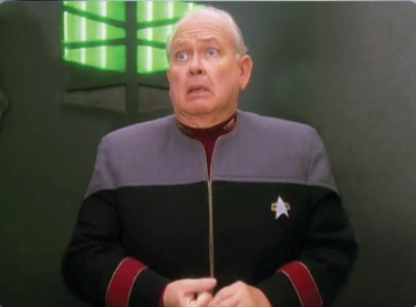
How dare I polish and remove kludges from previous releases. 😆
Also, none of those kludges would have even been necessary if the project scope was properly defined from the start and the project manager didn’t let the users keep trickling in new requirements without also extending the deadline.
So yeah, how dare I go back and implement something the way it should have been done the first time?


the user is always right
Yep, lol.
I hate how both of those things are true at the same time 😆
It isn’t always that they don’t know what they want, sometimes they just don’t know how to describe what they want, or they may know what they don’t want.
This may shock and amaze you but…
there is more than one user for your product. If you don’t know that, it sounds like you either haven’t done a user survey or you haven’t created the correct user profiles (based on that survey).
Creating a “perfect UI” without asking users what they want is not good UX. It’s just masturbation. The user survey tells you that people want A B C, etc. and in which order. You should know exactly how your changes are going to be received when you release them.
Imagine a restaurant that doesn’t ask you what you want. Instead the chef tells you “This is the best food possible” and just makes what they want. That’s what developing without a user survey is like.
You’re taking this far too literally. There’s a good bit of hyperbole in play here for the purposes of making a joke.
Next you’ll be telling me that’s not you in the picture!
Imagine you’re the chef at a restaurant and the guest tells you they want the fluffiest pancace possible, positioned vertically on the plate. In fact, they want three of them, stacked on each others’ rims. And vegan with extra eggs.
And when you finally serve that aneurysm of a dish, they tell you that in their dialect, ‘pancake’ actually means ‘lasagna’.
The Expert: 7 Red Lines
Hopefully the pancake/lasagna garbage could be caught by sharing some wireframes early on?
(Is this unrealistic?)
In fact they want four of them, each perpendicular to all othes
that is exactly how restaurants work. have you ever been to one? you are offered a choice of meals they designed and if you don’t like it, well, there is about billion other restaurants you may try, they are not going to start crafting custom meal for you.
You can’t be saying fire the private chef - that’s OP!
I sympathize btw, I sympathize
The user is always right about what they are willing to spend money on. That doesn’t mean they know what they want, although a lot of people don’t want to change.
That doesn’t mean all change is good, and it isn’t like any UI will ever meet everyone’s preferences. For example, I hate adaptive design interfaces that are significantly different in confusing ways on different resolutions. Like I understand switching a static menu to an expandable menu, but not moving the relative location of certain buttons from the bottom of the screen to the top or vise versa. But that might make sense for some use case that isn’t how I interact with it.
The user will forget about the old UI after 2 weeks.
I still constantly bitch about not being able to pin the taskbar to the side of the screen in windows 11.
There will always be some static-friction to UI changes, even if it’s a change that makes the UI more accessible overall. Everytime you alter your UI you’re taxing your users as it will take them some time to adapt to the new system. You should minimize how often you do this for that reason. Additionally, sometimes you may be unaware of an unintentional feature users appreciate that you’re depreciating.
I dislike your comment because it’s making a lot of sweeping generalizations (like that the UI changes are actually good) and ignoring the fact that users may have legitimate complaints.
Exactly. When discord updated their mobile UI everyone immediately hated it cuz different. There were legitimately some poor decisions made, but then they went and reverted like half of it after people had started to get used to it. For example, I got used to and liked where they moved dms to and they reverted it back, but kept having to tap on the name of a channel to view the users in it instead of just swiping left.
Edit: and I’m also now used to the bad things they kept.
If this were true we would still be riding horses.