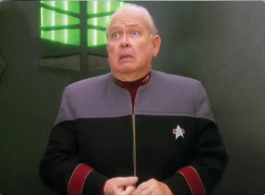
How dare I polish and remove kludges from previous releases. 😆
Also, none of those kludges would have even been necessary if the project scope was properly defined from the start and the project manager didn’t let the users keep trickling in new requirements without also extending the deadline.
So yeah, how dare I go back and implement something the way it should have been done the first time?


In all my life I’ve only experienced one UI overhaul that I considered an improvement, and even then there were a few specific features that were a step backwards, even by proper design standards (the same action did two different things in only slightly different scenarios.)
Buuiuuuut I know half the time it’s just because I’m used to the old way, only the other half is it some corporate bullshit trying to push a feature no one asked for.
Yeah, I get that completely. Which is why I rarely, if ever, overhaul the whole interface.
Pretty much every change is a refinement rather than a complete redesign. In this case, the complaint was because I moved a button that was just kind of tacked-on last minute in a previous release into the action menu where it should have gone to start with. lol
I can’t believe you moved a button. HOW COULD YOU??? I trusted you, Patrick.