There’s just something about fonts that are supposed to look hand-written but are too perfectly curved, every letter looking perfectly consistent, etc, that my brain rejects.
Like when you see CGI or computerised physics in a film that’s 90% there, but there’s something about it that you can’t put your finger on that leaves a somewhat jarring “this isn’t right! Something is wrong here!” in my primative monkey brain.
The term you’re looking for is “uncanny valley”
I thought that was just for humanoid figures, does it apply to paintings and such too?
That’s certainly where the term originated, but usage has expanded. I’m actually fine with it, as the original idea was about the pattern recognition we use when looking at faces, and I think there’s similar mechanisms for matching other “known” patterns we see. Probably with some sliding scale of emotional response on how well known the pattern is.
There is an interesting video made by a youtube channel called “Stuff Made Here” were he uses a robot hand and a program made to create fonts like they were hand written by humans and the results are impressive.
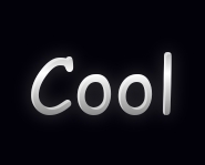
Damn, gradient and emboss? Put on your shades people.
😆
There are several monospace adaptations of Comic Sans which are great for use in terminals or IDEs. I particularly like this one:
https://tosche.net/fonts/comic-code
I have never seen another terminal font that is so easy and fast to grok.
I also bought and use this in a terminal and Emacs. I really do feel like it increases legibility at a much smaller font size.
Comic Sans really isn’t that bad, it’s just one of those things that became trendy to hate by people who are incapable of developing their own personality. Like the word “moist”
Let’s bring back those animated gifs (mailbox and under construction) from the 90s. That’ll get everyone riled back up again.
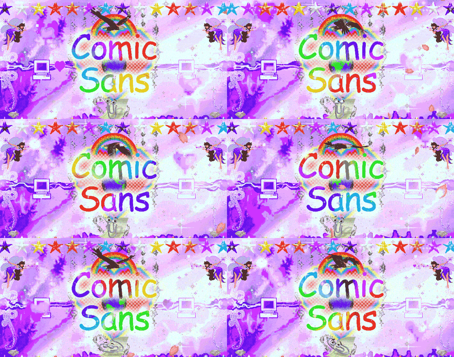
I’ve had this one in my images folder for at least a couple of decades. No idea where I saved it from:

It’s been a long time since I thought about Tenchi Muyo.
Ah man I really liked the OVAs. Wish there were more. Didn’t care for the characterization in the TV series.
never understood the backlash in the first place considering comic sans was one of the most accessible fonts
Obligatory:
I’m Comic Sans, Asshole by Mike Lacher from McSweeney’s Short Imagined Monologues June 15, 2010
9/10 should have been written in comic sans.

Can we talk about Papyrus
I… actually never hated Comic Sans and never understood why it was so hated. I mean, at least everyone knows about it.
I always thought the Algerian font was ugly as hell (it probably has nothing to do with Algeria)
PaywalledI’m silly
Damn, if only OP had listed some way around the paywall…
Ikr? Fuckin op 🙄
I didn’t even see it because clicked from the main feed. lol
Thank you!lol, it happens
There’s a Reader mode in Firefox/Mull that you press before the page completely loads, i.e. before the wall appears. Works on most sites.
If i were better at frame perfect tricks I’d be a speedrunner.
I can only get it to work sometimes. Pages often load too fast for me… I’m washed up…Same here. 😅
Is the URL broken for anyone else?
Yeah, looks like 12ft is the issue, even their homepage won’t load for me.
504 Gateway Time-out nginx/1.18.0 (Ubuntu)
Luckily I got the default Atlantic URL to load with my paywall blocker.
