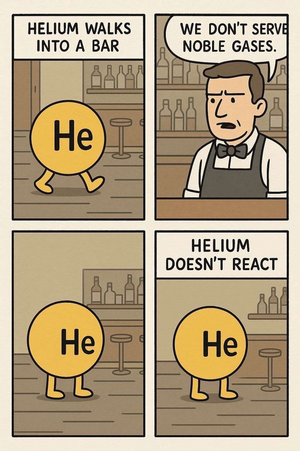
Inconsistencies. The bottles are different in every panel. The door is missing after the first panel despite not being any closer to the bar. The scale is way off from the other two in the last panel. The bar fades out of existence in the last panel, and the wall panel is gone. The text being cut off on the edge of the second panel.
Some things got me suspicious. Some patterns, the art style, the colors are “a strange choosing”… everything is so “overly perfect” except for the letters that feel kind of off… like someone had to unfuck the text. Besides, this is some polished artwork for a random comic with no firm.

Real question, how can you tell it’s AI?
Inconsistencies. The bottles are different in every panel. The door is missing after the first panel despite not being any closer to the bar. The scale is way off from the other two in the last panel. The bar fades out of existence in the last panel, and the wall panel is gone. The text being cut off on the edge of the second panel.
Amongst all the other tells pointed out. The most obvious one right now is whats dubbed “AI-sans font”
There is atm only a single generator that can make this quality though. All ai generators have their unique quirks you learn to identity.
Same yellow-ish pallette
Some things got me suspicious. Some patterns, the art style, the colors are “a strange choosing”… everything is so “overly perfect” except for the letters that feel kind of off… like someone had to unfuck the text. Besides, this is some polished artwork for a random comic with no firm.
But the real give away for me are the bottles
Bottles in the background change every panel