Image 1

Image 2

Image 3

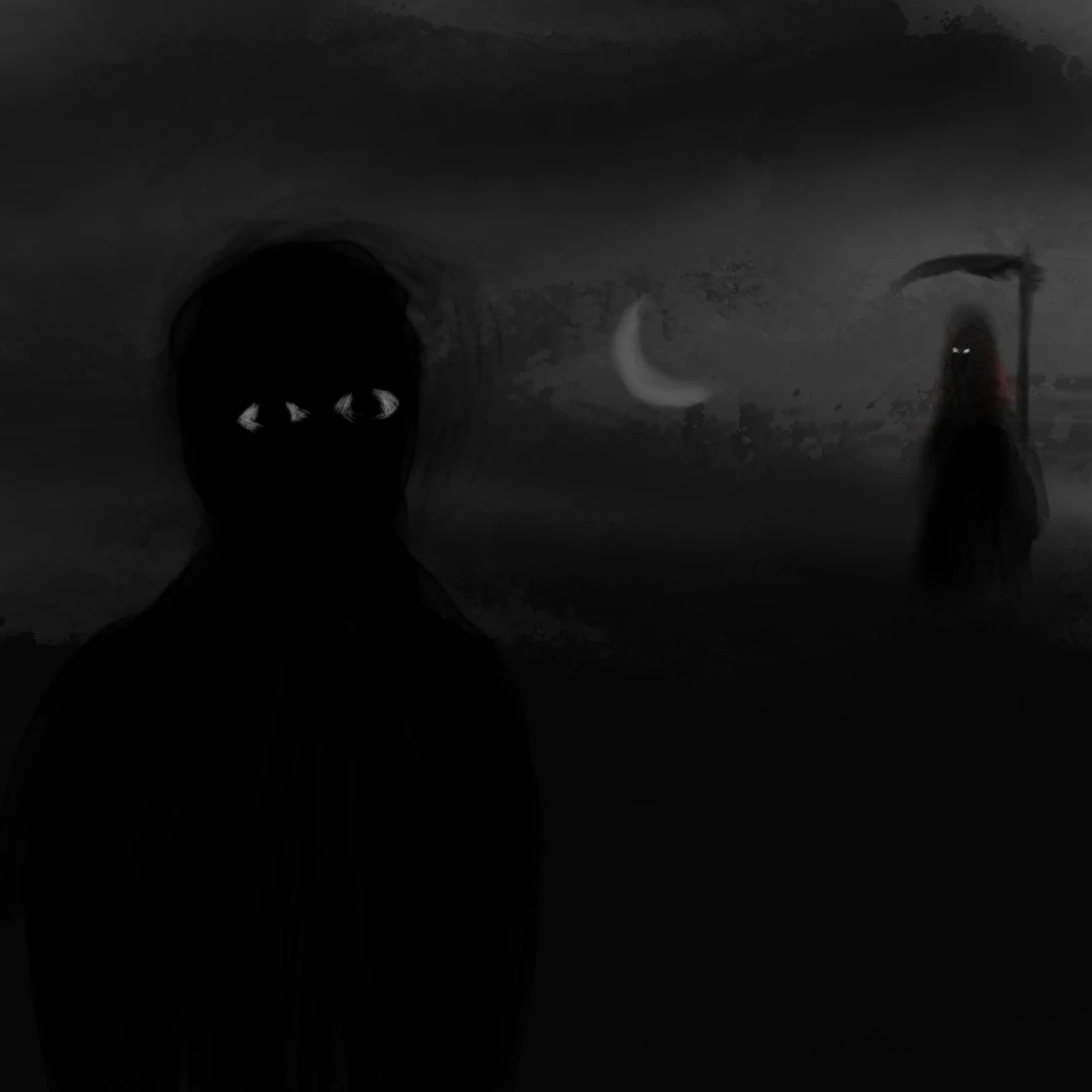
Maybe the shadows weren’t as harsh as i expected them to look…
@maya_the_good_apple@sh.itjust.works @artshare@lemmy.world
This is very interesting, I liked the slight roughness of the shadows.
I often notice this difference between the techniques of different artists: art is usually born from tracing the outlines of the form (as you did in Image 1), which eventually gets a fill color (as per Image 2). For me, on the other hand, the form is born through base filling, maybe because of the medium (a digital canvas, where a brush stroke can be digitally erased or pruned without leaving traces as it happens on physical canvas/paper). With this kind of drawing technique, depth occlusion and/or the interplay between light and shadow end up being part of the draft itself.
Not sure which software app you use for drawing, but if advice is welcomed, two things help me doing 2.5D depth in my art: a set of water brushes which acts as a synthetic paint (it slightly smudges and blends colors while mixing a wave-like texture according to the current flow percentage; the brush in question is for Sketchbook, but there are likely similar brushes/modes for alternative drawing softwares/apps); layers (dozens of layers) and their blending modes (esp. “multiply” and “linear burn”) and the blur filter. I often do posing and anatomy from my visual thoughts, but I also do rotoscoping (drawing over a reference picture) of real photos and/or from dummy/mannequin posing tools; in latter case, the reference comes with depth of its own, which I try to reproduce with the brush.
maybe the shadows weren’t as harsh as i expected them to look
I’d say it has partly to do with the background. Your image (esp. the Image 3) is a transparent PNG, your canvas was likely gray or white, but then you posted to Lemmy, whose UI has a dark background, so the different background ends up changing how our eyes perceive the light-shadow interplay.