…i just want my icecream sandwich back…
are floating controls that good? I mean, over bottom bars
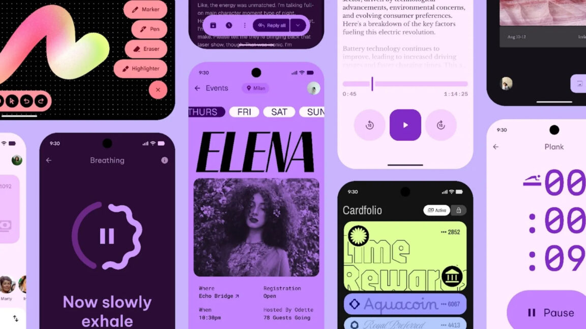
I like it because it’s kind of ugly but feels likes it’s going to be iconic
I like it. Takes a chance at being original.
2018 - adds digital wellbeing features to help you disengage from your device
2025 - makes the entire interface more engaging to help keep you engaged
It looks nice. It’s like having a casino in your pocket.
Are these more design options? Or will we be forced to have an “expressive” tacky looking design
C’mon. By now, you should know it’ll be forced, and we’ll lose more functionality at the same time.
I don’t see why they can’t just make the system more customisable. This stuff is highly stylised and ugly in my opinion.
But I don’t like bright. Everything dark please.
The biggest thing for me is it looks like they are finally giving us back more than 4 quick settings in the notification pull down. They’ll probably mess it up somehow, but one can dream right?