

I graduated in 99. Didn’t think I’d make that big of a difference.
God damn it. I already woke up wanting a hotdog. This is just making me hungrier.
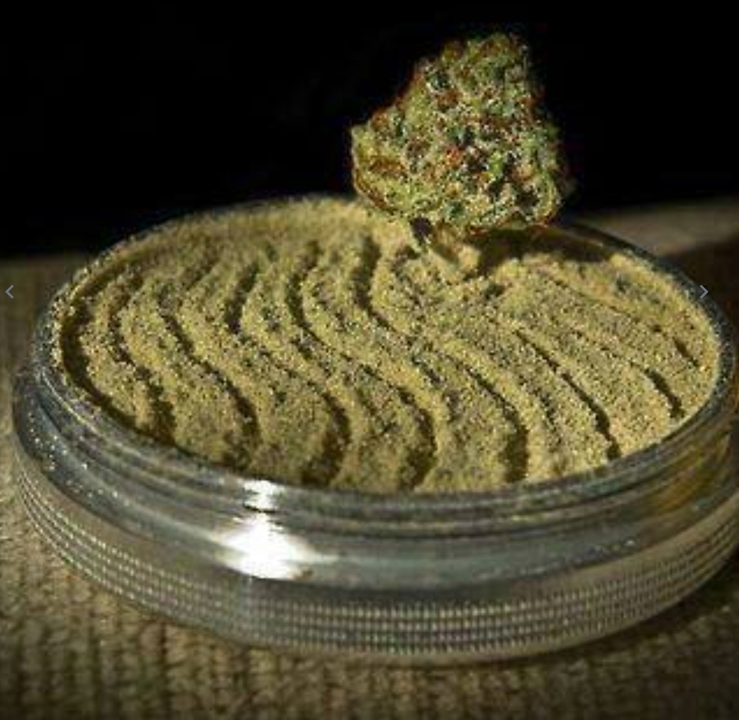
I recognized the j right away but the hotdog bun took longer, and imagining eating a j on a hotdog bun is really disconcerting.
Also a negative percent change from previous year is a wild thing to try and visualize as being bigger than the previous year but ok.
It’s ok: you only get this value every two years. That way, even though it’s a decrease from the previous year you have actually no idea whether the figure is higher than two years before
Oh my God I didn’t even notice that… Wtf
Gotta make sure everyone is still angry about the kids smoking the devil’s lettuce. Dropping numbers are highly inconvenient when you’re trying to rile people up.
See also: crime statistics.
Bluntdogs
What. the. fuck.
I think this graph just gave me a migraine.
So to be clear: there is no correlation between weed use and hotdog use, other than that they’re both in decline. This means that they created this graph showing two unrelated datasets for no reason other than that they could. Or, maybe, because they wanted to use the cursed image of a spliff in a hotdog bun.
THC makes you hungry, and hungry people eat hot dogs. Checkmate, atheist!
With THC everything seems more edible than it really is, even Hot Dogs.
I imagine they’re trying to push an agenda of some sort
This graph is such an awful data visualization that it’s almost art
I don’t see the problem.
*exhales* Anybody else wanna hit this shit? It’s so good.
I understand everything about this except why it exists in the first place.
First glance def had me thinking this was gonna be tampon related
I thought raw fish
What the fuck is this data trying to say?
deleted by creator
But the percent changes are negative. Look at the axis labels.
I agree with all the comments here, but also, now I’m craving hotdogs.
Risky click of the day
Why so blunt?
Poop


