

Africa is the big loser in the current system, as the Mercator map makes it look far smaller than it really is. Europe and Russia would look far smaller (their true size) in a corrected map. Brazil is also a beneficiary with a corrected map; it looks far bigger in reality than the Mercator map represents it.
The campaign seems to be going places. The World Bank says it is phasing out the use of the Mercator map, and various UN bodies are looking at doing the same.
African Union joins calls to end use of Mercator map that shrinks continent’s size
I remember this episode of The West Wing.
The question isnt wether the mercator map is in need for replacement. Its about what alternative map to use instead that we can all agree on.
I’m ok with this as long as we can continue to leave New Zealand off any replacement.
Why not just use photos of globes?
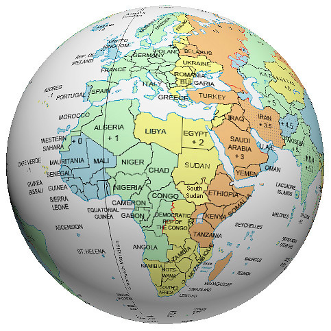
Every projection between a sphere, or even sphere section to a plane is going to have distortion. You can make tradeoffs between different distortion types, but you wont eliminate them.
I think that helps somewhat, but it still distorts the poles, just with an added hint of depth
It does, but if the problem is under-representation of Africa, well, the poles don’t matter.
Why you gotta do Poland dirty like that?