
Lol try printing that on merch, dumb dumb. That’s an awful logo. It’s really not even a logo, it’s a scene.
Reminds me of the very first Apple Computer logo:

They dropped that for a simpler logo, and then dropped the simpler logo for an even simpler one.
I would love to see a parallel world where all tech companies logos were all this detailed and old looking
And all the cases had wood paneling
IBM’s wasn’t nearly as detailed but I really like it too

Wait, is that for real?
Wow, yeah, that would be awful in most contexts. Imagine trying to print that on the front of a computer haha.
I’m pretty sure it was just a sticker for the first 20 years or so of Macintosh’s life, so I kinda doubt it would have been an actual issue.
Actually, I had one in like 99’ that had one of those cool bubble stickers for the logo. It was the Technicolor apple one not this, obviously, but I don’t see why this couldn’t have worked as a sticker back then
Because if you printed it the size of the Apple logo you’d need a microscope to make out anything on it.
I mean… Stamps
Yeah they ditched it in favor of the rainbow apple I think before they even started mass production of the Apple ][.
High tech with a 19th century sense of style? I’m sold!
Leather bound user manuals
Cases made of brass and oak
Big clicky switches and knurled knobs
If this was reality, I might get me an apple computer lol
Maybe for the 50th Anniversary Macintosh
One can hope
Lol “dropped”
Well played.
Back in the day I legit wanted someone to make a custom black MacBook case that had the Newton logo instead of the Apple. Imagine how cool it would look glowing!
Yet that is still simple for its monochrome … While the ai logo looks like tacky clip art.
Morebranding than logo. Looks like a label from an old bottle of tonic.
Even if you took that image and used it to create a black and white illustration, it would be way too busy. The logo on the left isn’t exactly amazing, but it’s decent and checks all the boxes for usability and readability. The one on the right is more like… an image made for an ad which you can’t put on a hat for example. The amount of times I’ve had to explain logo basics to a client who want to do something like the image on the right isn’t great, but they usually understand why these rules are in place after explaining and they generally respect my expertise. But not everyone…
Why is the first thing I thought of Tabitha when I read dumb dumb XD
I work in an industry that deals with customer logos almost exclusively. I now get at least one person a week bringing in garbage-tier art they made in Canva or whatever that isn’t made to any standard at all, so they have tons of thin lines, gradients, blurring, etc. Shocker, AI only thinks about making it visually appealing when it won’t translate to a one-color, doesn’t have PMS tones to base it on, no simplified version, etc.
People think making a logo is just that. Just the image itself. They don’t think past what’s in front of them.
In my experience, most people have simply never thought about it before. If someone decides they want to open a bakery and they have never had a business before, they haven’t thought about everywhere their new logo will be used unless they get that expertise from someone. I’ve gotten pretty good at explaining these concepts to people and they typically respect my expertise and take my advice, but not everyone 😆
And that’s just it. In the past, you would have contacted a branding firm and paid someone with expertise to do all that for you. Now people think, “Why pay a branding firm when AI can do it in 5 minutes?”
I would think AI art would be perfect for the use case of “here is the general gist of what I want, now turn it into something usable”. I can also imagine basically nobody actually using it that way correctly though lol.
They don’t think past what’s in front of them.
I’m pretty sure you just summarized the human paradigm.
That being said, there are also thousands of logos that go through proper design companjes and they pay a lot of money out and get literally just the name in a standard sans serif font or abstracted until it is unrecognizable as a name like KIA or TVA.
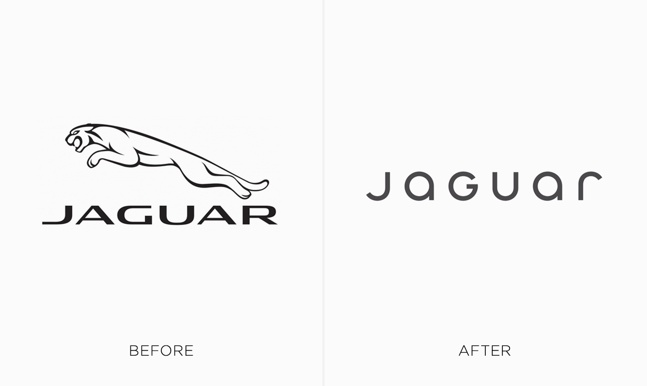
https://digitalsynopsis.com/wp-content/uploads/2024/02/logo-redesigns-rebrands-worst-jaguar.jpeg
https://nataleerushurst.blogspot.com/2022/08/alphabet-company-history.html?m=1
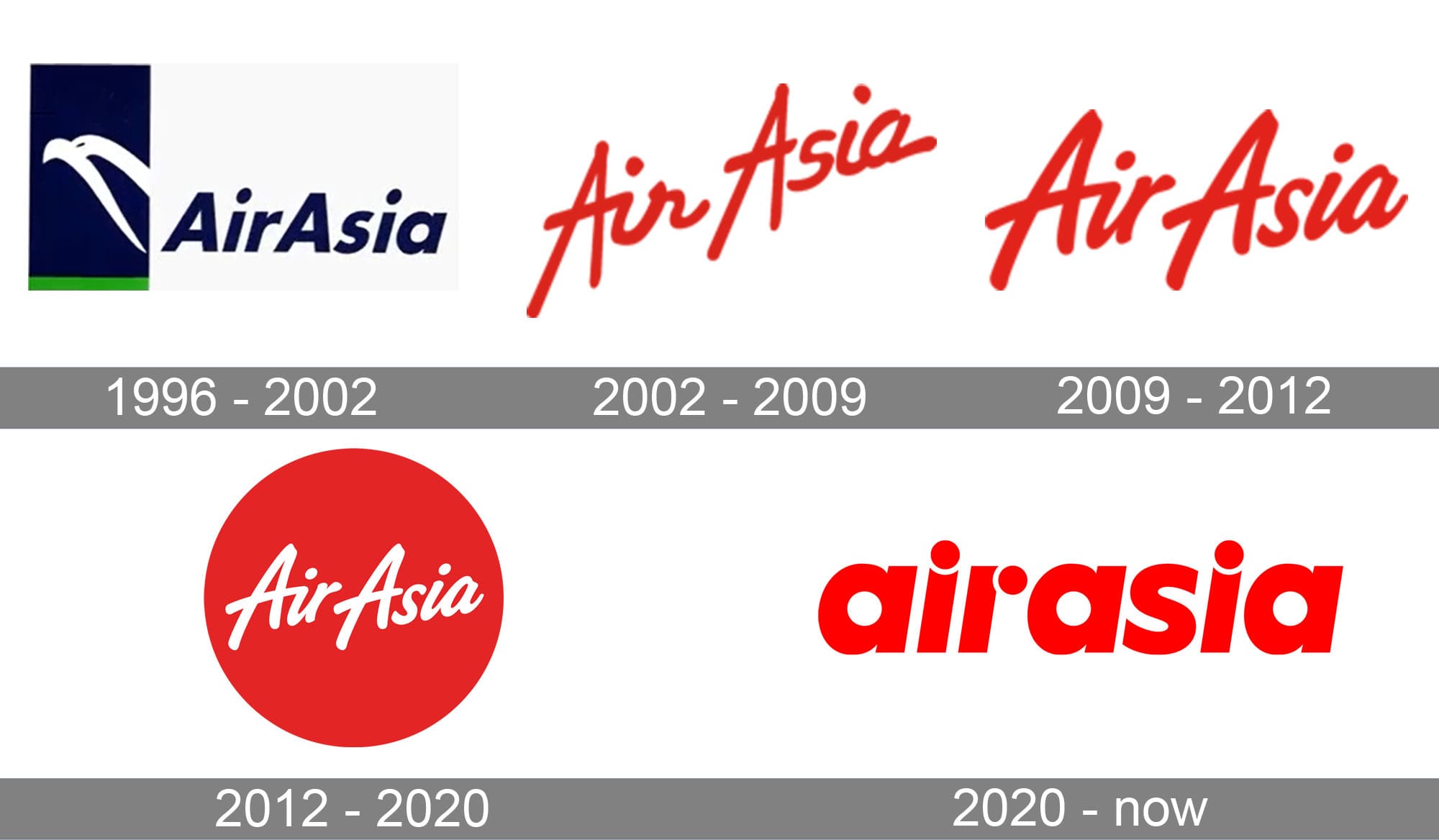
https://1000logos.net/wp-content/uploads/2020/04/AirAsia-Logo-history.jpg
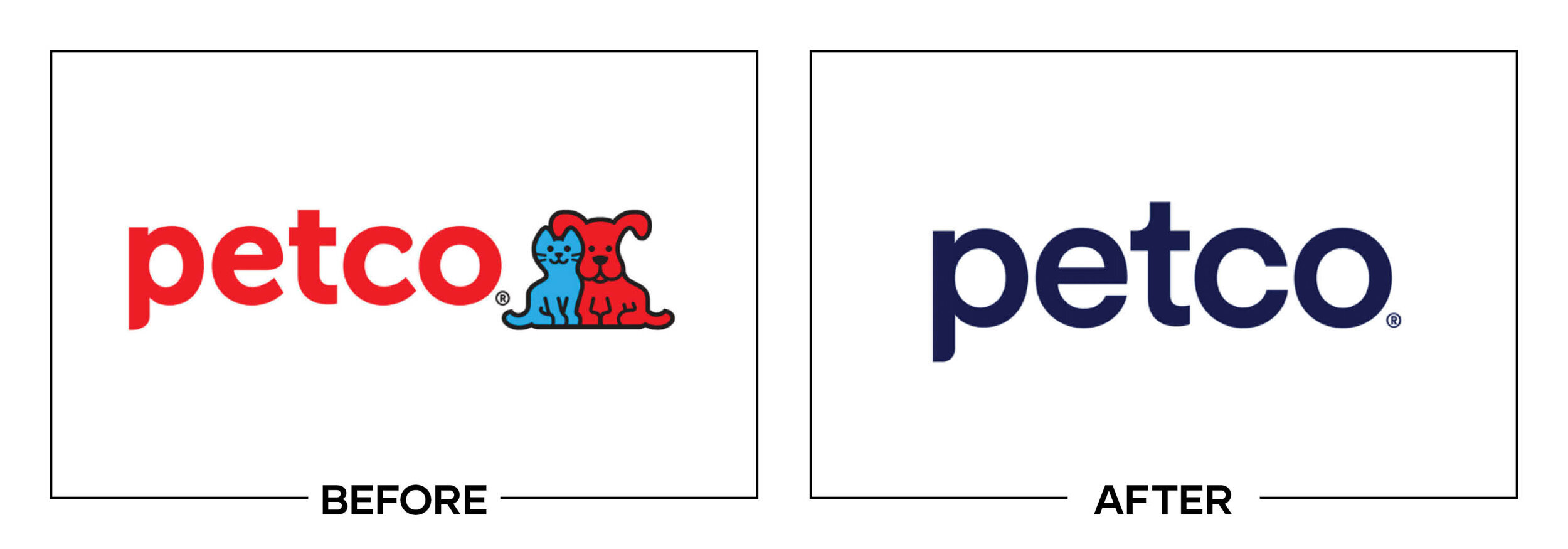
https://storage.googleapis.com/ftidag_prod/activities/stad-gent-2/logoGent_c100.png
And the list goes on, Verizon, gap, tropicana, jcpenny, etc…
I mean, AI is trash, but it can also be extremely difficult to know if you will get a decent logo after paying thousands or tens/hundreds of euros spent (looking at you Belgium cities using millions of taxpayer euros for bad rebrands).
See I was all against the new Kia logo until I saw their new cars they started releasing about a year later. It really matches their new design language. I think they should have rolled out the new logo on cars only after their refresh so you don’t have older style vehicles with the new style logos
Devil’s advocate: Another way to think of it is that as AI tools mature, we will see more tools make an impact the way template-based web builders transitioned us away from, at best, charmingly kitchy html business websites of '95-'05 that are horribly optimized and broken half the time towards standardized options that cover the basics with curated choices for clients to express themselves without hanging themselves. Yes, the template builders did homogenize business websites, but for all the businesses that weren’t going to/couldn’t pay for a serious web developer/designer anyway I’d rather go to their website and experience a bland predictable layout than experience my browser melting even though there may be a glimmer of creativity from the enthusiastic teenager they hired to build it from scratch (I was that teenager).
We’re all fixated on how AI could not do the work for the top 25% of clients who require high quality professional work. We forget that 75% of clients cheap out for DIY/scam/hack options when it comes to design, resulting in lots of crap in the ether. AI tools have huge potential for smoothing out the low-hanging fruit of basic pain points.
The difference will be that AI doesn’t understand the basics and can’t curate choices to instead it will be a regression to wildly different and unoptimized web pages as each person wants to do their own spin on things instead of listening to experts.
Well no, the AI doesn’t do the curating, the company running the AI-powered platform does the curating. Neural Net AIs aren’t built to understand anything. The company running the platform curates the training, prompt engineering, and non-AI structures (algorithms, rigid parameters, and basic rules) that hone the generative AI into maximizing the desirable kind of outputs and minimizing undesirable outputs for the specific field of tasks.
We’re actually already seeing this happen in some cases. There’s a company that I believe Procreate has partnered with that is commissioning designers to create website elements for them to train their AI with for their website template creator.
deleted by creator
Personal taste is totally fine, but what you’re describing isn’t a logo, it’s an illustration. A good logo specifically must be simple so that it can be applied across a bunch of different contexts — print, digital, large, small. What if you wanted your logomark as a favicon? Depth and lighting would make it look like a smudge at that size. What about stitching your logo onto a hat?
This is the main issue. Logos are part of a brand system, and generating a logo with AI circumvents all that thought. You get something that might look good, but your whole system becomes super fragile.
Again, there’s no disagreeing with personal taste, it’s just a matter of thoughtful use of the system and medium.
deleted by creator
(Not the original guy that replied to you) I do agree about the blandness of many logos (god I hate flat design) and think the logo on the left is very bland, but the one on the right just does not work in many contexts. There’s a middle ground where it works just fine, but with as much detail as in the AI gen logo it will look awful at small sizes. One is usable as a general purpose logo, the other isn’t.
I totally agree that more diversity in art makes things more interesting, and I’m a big fan of bucking trends to make things unique. Art should be able to exist on its own merit, as the artist intended, divorced from what would make a better t-shirt. Even stepping out of art and into design, it makes me sad how many cars are grey, black, or white. Let’s get some variation!
But… This is a logo. It’s not a poster. It’s not a t-shirt or a building or a painting. It’s a logo. As such, there are some specific criteria that will make it better at being a logo. It needs to be instantly recognizable. It needs to be legible across a wide variety of contexts, sizes, mediums, and color applications. As a result, logos tend to be better if they’re simpler.
The AI output is an illustration because it uses things like shading, complex shapes, and shadows, etc… Can you use an illustration for a logo? By all means. In some situations, it’ll probably look nice. But at a certain size, it just won’t be recognizable, and then it won’t be doing the main job you want a logo to do — be instantly recognizable across as wide a set of scenarios as possible.
Also, to be clear, I’m not a fan of the logo on the left either. It’s not particularly imaginative, the highly variable line weight makes it feel in cohesive, and the details mean it probably wouldn’t work well at small sizes either.
Try embroidering your “logo with lots of colors and gradients, depth, lighting” on a polo shit and see how little of it actually translates. Or even a one color print job on a mailing. It will look like an unrecognizable hot garbage smudge.
Not only will it look terrible it’ll be significantly more expensive, each color and complication is going to add to the price. A simple logo with a clean silhouette is going to look nice and save money.
deleted by creator
If you hire a human designer there’s a much higher likelihood of it looking good.
That’s really only suitable if the logo is going be displayed at a larger size on a screen. Many times logos will be displayed much smaller, such as when used as a favicon. When you cram too many details into a small space it just becomes noise. This also applies if people glance at the logo, since too much detail will make it difficult to work out what it is.
Also as other people have mentioned. If you are going to be printing your logo, then you do need to have a design that uses just negative and positive space since it’s easier to print and will look much cleaner.
Additionally it’s pretty common for organizations to have multiple versions of the logo as well. Usually a black and white one, a colored version of it, and versions with and without text. They could also have a more detailed version of the logo as well, but the other versions are more useful, so they may not even bother.
You might just need two versions. The full colour one where the underlying medium supports it well, and a mono version for more restrictive media.
That logo is terrible.
Like, a core component of a good logo is that it’s easily identifiable at a glance at all shapes and sizes and on various backgrounds… complicated photorealistic logos basically lack all of these criteria by default.
This is why you need someone experienced not some ai slop.
Removed by mod
anyone with a year of design training will know why the right “logo” is a pile of shit.
anyone with a month of experience printing will know why the right “logo” is a pile of shit.
anyone who has had 5 minutes with genAI will think they’re a design master when they create the “logo” on the right.
I disagree.
Anyone who has spent a few minutes thinking about what a logo is and what it’s used for will be able to tell you that one of these is a logo and the other is… a picture.
No experience in printing, but I guess its impossible to Print that Logo with that Kind of Detail in a timely manner without it looking like shit?
Also, everyone who ever heard about web design and hosting will know that such a picture is impossible to scale up and down, and also that picture will take up literal gigabytes since you can neither use normal PNGs because of the quality nor vector based art (they store the picture as mathematical equasions, so the PC has to render them, but it can be indefinitely made smaller and bigger without it becoming more pixely) because that sort of detail will just be impossible to render on grandmas smart TV from 2010, so you will have to store this picture as PNG in different formats as many times as you want to display that image
No, you understand the printing problem. Any logo needs a vector version so it can be scaled to any size. Lacking that is a non-starter.
And don’t start me on the colors.
No. You don’t need a year of design training. It is redicilous you buy in to that idea. It is a rage bait ad because it generates most clicks and therefore ad company revenue. Nobody alive thinks that is a good logo. That is the point.
MagicShot.ai - Al Logo Geneator
Geat work
I’ve seen so many commercials where a realistic scene fades into the stylized logo that that’s what my mind went to.
The left is a better logo, fewer fine details, easy to silk screen, easy to laser print, hell you could make a branding iron and burn it into wood.
I can’t see the video on mobile right now but every time i see the 20th Century logo all I can think about is the Who Cares parody someone made.
I needed to see that. Not yet available on a Peertube instance from what I can tell, but here’s a yuutoob version Yuutoob video parody version of the 20th C Fox film opening
Logo on the right is what you give a marketing team so they can tell you the 600 ways it won’t print right, cost too much to display, and ultimately rework it into logo on the left.
Looks like they are missing the plot. Logos are supposed to be simple…
Did you seriously think the freelancer isn’t capable of creating something like that? Like, do you think that FedEx uses their name with a hidden arrow in the “Ex” because they couldn’t hire anyone to draw them a photorealistic delivery truck with a box on it or whatever? Microsoft can’t figure out how to make a window with reflections so they use the squares?
The simplicity isn’t an accident.

Right?!? I wonder what happens when the business with the AI logo has to pay for full-color printing for all of their materials because their logo is so visually complex.
This isn’t an issue if you solely operate digitally, but a storefront needs signage. Advertising becomes much more expensive in process color than 1 or 2 spot colors. Most physical businesses need things like business cards, invoices, purchase orders, packaging, …
A professional designer will usually create a 1-color or 2-color logo to use for some of those things even when you have a full-color logo design to use on the most “important” materials. AI won’t give that level of service, for sure.
You realise you are the ones in being ridiculed with rage bait ads here? Nobody uses these and it’s, like with the last five thousand rage bait articles, only looking for engagement. Nothing else.
I think maybe this isn’t the community for you.
Sorry, I don’t like being in cozy communities with single minds. I like interacting with humans, especially those with contradictory opinions
Then maybe not a Community with the name “fuck ai” if you want “contradictory opinions” on ai
I don’t understand? You are reacting with the exact designed rage and providing the exact free exposure the rage bait ad was selected to incite. None of it really has anything to do with ai?
There are plenty of communities for that. I like those too. But sometimes you just need to do bits on stupid AI slop.
But this is rage bait. It wants people to react the way you do and send to a friend. Only those still less informed when reached is their target that they want to sell ai to. It is pretty entertaining to view people so angry that they don’t understand they are being played and ask them about it because most of the time they double down on their fury and it can lead to very deep personal conversations about their fears and reasons they are hateposting on the internet instead of living, it is interesting to me how people come to these behaviors
“I created” and “with AI” is the newest oxymoron.
Art imitates life

This is the modern-day equivalent of Frontpage/clipart
I get what you’re saying (esp low-quality clip-art), though lots of clipart was actually vector art (like autotraced from physical art, giving some prominent styles) so would probably make for a better logo than what they generated here.
Imagine the printing costs of putting variations of the right on all your products? Just the color variety alone would add to the production costs.
Reminds me of German Designer Kurt Weidemann who redesigned the Logo of German train company Deutsche Bahn in the 90s. He inverted the colors, got rid of one outline — and still saves the company millions over the years because of the paint that is saved putting the logo on all trains. All while modernising the typography, but remaining true to the brand.
This is what design is about — everything else is decoration.
And will look like shit even if you manage to do it. Imagine that on a cushion cover after an year of use.
AI generated art is the new “cousin who knows Photoshop”.
This is fine, and mostly benign.
Ai did a shit job.
-Ex graphic designer
Maybe your trained eye can tell better than me but it looks to me that the homecraft name in the AI one isn’t even centered properly.
It’s the style lol


